
The typical chart (or graph) in Excel 2007 comprises several distinct parts, including the chart area, data series, axes, legend, plot area, gridlines, data markers, and more. The following list summarizes the parts of a typical chart, some of which appear in the illustration.
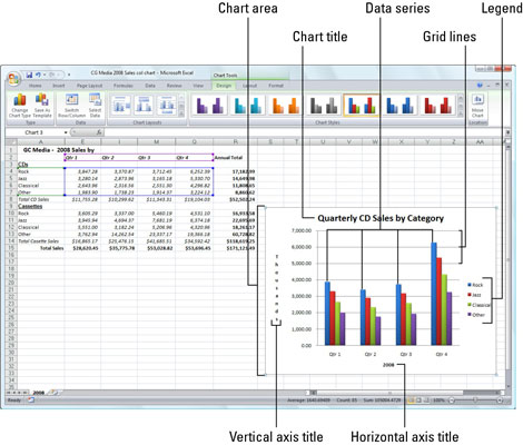
A typical column chart containing a variety of standard chart elements.
- Chart area: Everything inside the chart window, including all parts of the chart (labels, axes, data markers, tick marks, and other elements listed here).
- Data marker: A symbol on the chart that represents a single value in the worksheet. A data marker (or data point) may be a bar in a bar chart, a pie slice in a pie chart, or a line on a line chart. Data markers with the same shape or pattern represent a single data series in the chart.
- Chart data series: A group of related values, such as all the values in a single row in the chart. A chart can have just one data series (shown in a single bar or line), but it usually has several.
- Axis: A line that serves as a major reference for plotting data in a chart. In two-dimensional charts there are two axes — the x-axis (horizontal/category) and the y-axis (vertical/value). In most two-dimensional charts (except column charts), Excel plots categories (labels) along the x-axis and values (numbers) along the y-axis. Bar charts reverse the scheme, plotting values along they-axis. Pie charts have no axes. Three-dimensional charts have an x-axis, a y-axis, and a z-axis. The x- and y-axes delineate the horizontal surface of the chart. The z-axis is the vertical axis, showing the depth of the third dimension in the chart.
- Tick mark: A small line intersecting an axis. A tick mark indicates a category, scale, or chart data series. A tick mark can have a label attached.
- Plot area: The area where Excel plots your data, including the axes and all markers that represent data points.
- Gridlines: Optional lines extending from the tick marks across the plot area, thus making it easier to view the data values represented by the tick marks.
- Chart text: A label or title that you add to the chart. Attached text is a title or label linked to an axis such as the Chart Title, Vertical Axis Title, and Horizontal Axis Title that you can’t move independently of the chart. Unattached text is text that you add with the Text Box command buttonon the Insert tab of the Ribbon.
- Legend: A key that identifies patterns, colors, or symbols associated with the markers of a chart data series. The legend shows the data series name corresponding to each data marker (such as the name of the blue columns in a column chart).


Post a Comment